
Squares Not Lines, A Visual Shift in Reading
A new form to present text by arranging words in squares and breaking away from traditional sentence syntax.

I am conceptualizing a new form of presenting textual information or narrating stories, which is more suitable for digital mediums like smartphones compared to traditional forms. In the traditional method, words are lined up to form a sentence, then a paragraph. Eyes still need to follow each word to grasp the meaning of a sentence.
I am offering to use square or cell as the basic unit of presenting text. It's a space, a bag of meaning, which contains a collection of text elements — words, phrases, unfinished sentences, etc. — that together convey a message or part of a story, but not necessarily in the conventional sentence structure. It's not only about the look, the content of a square doesn't need to comply with a strict sentence structure, making it more free or probably concise to express a meaning.
Unlike traditional linear text, these squares allow for a non-linear narrative, enabling readers to explore content by scrolling in any direction—left, right, up, or down.
This way we break away from the traditional way of constructing sentences and linear storytelling. Plus, We can add more layers of meaning by using styling, colors, animations, multimedia, and even interaction.
let's explore...
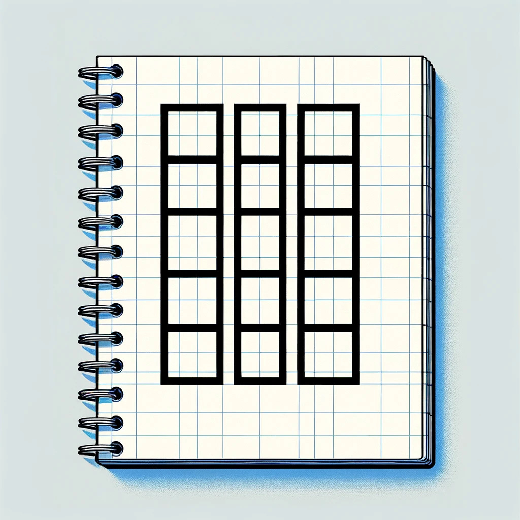
Scrolling Down The Squares
Think of each square like an Instagram post, only instead of pictures, they have a few lines of text. We can play around with styling, color, and even animation to enhance the readability and add an extra layer of meaning. The overall design should feel clean and simple, with a focus on text.
As you scroll down, it's like following a path from square to square, taking in each thought.
Squares don't need to comply with the traditional sentence syntax and structure -- actually, it's recommended to not. maybe we can define a square as follows:
It's a space, a bag of meaning, which contains a collection of text elements — words, phrases, unfinished sentences, etc. — that together convey a message or part of a story, but not necessarily in the conventional sentence structure.
To finally see what I’ve been talking about, let’s look at the following example, representing a simple narration in six squares. You first read it only in text, focusing only on the content and meaning. It is then followed by a picture that shows the sequence with the added layer of styling and colors.
Square 1: Awakening
Content: "First light - yawning dawn - the quiet before the day begins - a single bird's call."
Square 2: Journey
Content: "Rush hour - the rhythm of footsteps - 'Lost in the crowd,' she thought - city's heartbeat."
Square 3: Challenge
Content: "Deadline looms - a spilled cup, forgotten - 'Together, we achieve' - the satisfaction of a puzzle solved."
Square 4: Pause
Content: "Escape to green - bench solace - a squirrel's curious glance - 'Breath in, breath out,' the world slows."
Square 5: Homeward
Content: "Evening's glow - the familiar turn of a key - a home-cooked meal's aroma - 'At last,' a sigh of relief."
Square 6: Rest
Content: "Night's canvas - a book falls, forgotten - into dreams, we wander - 'Tomorrow is another story,' whispered to the stars."
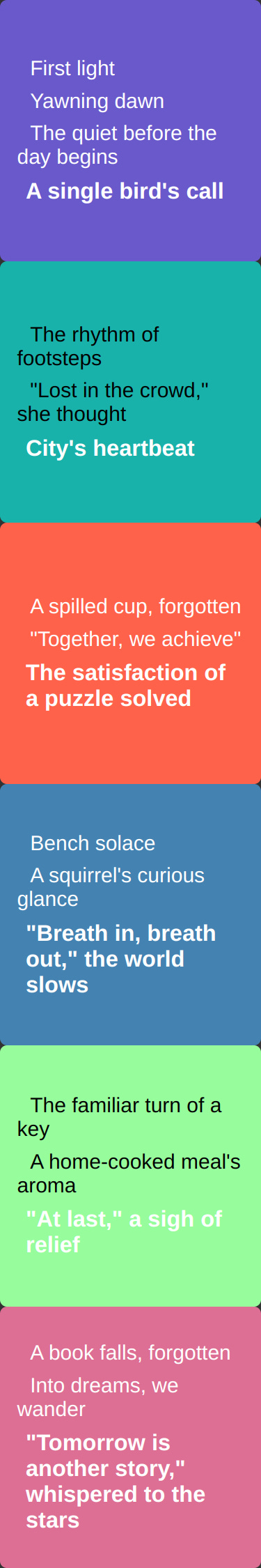
You see the content of each square doesn't comply with the traditional sentence structure but they still imply a meaning and we could infer a narration from the sequence.
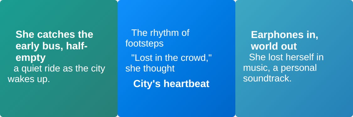
New Dimension
We can scroll to adjacent squares in the 2D space which enables us to break away from traditional linear narration. we can either use this for adding new paths to the narration or giving the users the ability to explore more detail in the same square. Taking the previous example, what if users could explore more detail in the first square by scrolling left or right?
The following, reveals more detail about the protagonist's journey to work by adding two squares to the left and right side of the second one.
Left Square: Commute
Content: "She catches the early bus, half-empty, a quiet ride as the city wakes up."
Square 2: Journey
Content: "Rush hour - the rhythm of footsteps - 'Lost in the crowd,' she thought - city's heartbeat."
Right Square: Music
Content: "Earphones in, world out - She lost herself in music, a personal soundtrack"
About the look
As you can see in the examples above, I prefer extremely minimalist typography design with some adjustments to enhance the readability and flow. Starting with a simple text inside a square as a baseline, we can adjust the following factors for words and phrases within a square to polish the design.
Font weight, boldness, and capitalization.
Font color and background color.
Indentation
but we should consider:
The separateness of elements: Respect the separateness of elements by making them visually visible but very subtle.
Balanced Adjustments: styling is made in moderation to avoid distraction and maintain focus on the text.
Contrasting Colors: Contrasting colors may be used sparingly to highlight certain text elements without overwhelming the design.
Simple Layout: The layout is kept simple and clean, with minimal distractions to ensure optimal readability.
Writing In Square
Since this is a whole new approach to representing content, we need to shift our thinking and let our imagination go wild to match this style. By hey, we're at the dawn of a new era. We can lean on language models for a little help. In fact, I crafted the narration being used here for demonstration using Chat GPT.
What's next
It might be a good idea to put together an online demo or web app to explore how powerful this medium can be in presenting textual content. As suggested before, we can generate the contents using LLMs.